There’s a lot that goes through my mind when designing a table. I am constantly changing and tweaking my designs until I feel like it all just “fits”. I won’t even buy anything until I can visualize the whole table in my mind.
I draw upon the art education I've had quite often. One of the most important lessons I learned involves making sure that the eye flows properly around the "art work". Typically there are several ways to accomplish this, but with this table I struggled since every food element on the table was white. Colors, shades, even the shapes of things are very important in my design process. For example, when I designed my Pea in the Pod table, I not only coordinated the green, white, and accents of yellow, I also incorporated a lot of round elements in the table. It provided further cohesiveness, and visual stimulation.
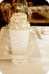
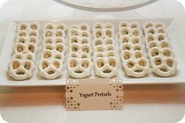
This all-white dessert table was designed for a 40th Birthday Party. When designing a monochromatic table, I found that texture was very important to me; it really helped separate the items and give contrast, without the use of different colors. I tried to make sure I incorporated lots of texture in the cake frosting, through the use of popcorn, in the candies, etc. Another element I used, along with varying textures, was to create varying heights in this table. Although this table doesn't incorporate a lot of taller elements, I used the cake as the focal point and the ferns to help draw the eye up a bit. Other food items, like the donut holes, candies, and popcorn gave a smaller, but much needed, “lift” as well.
This table was so fun to put together, and I was really happy with how everything turned out. I love how a dessert table will take any party to an entirely new level. I hope you enjoy looking at it as much as I did creating it!
We’ve linked to…


 Click on this link to check out Whitney’s new Etsy shop. Her amaaazing Halloween Party in a Box is now available for purchase!!
No comments:
Post a Comment